Your Link Shows Up as a Gray Box. Here's Why — and the Five-Minute Fix
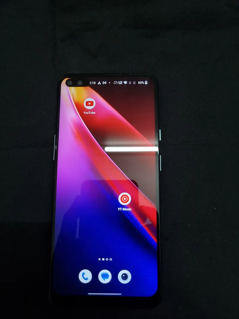
Photo: Gannu03, CC BY-SA 4.0, via Wikimedia Commons
You paste a link into a group chat. It arrives as a bare rectangle with a broken-image icon and half a domain name. Nobody says anything, but everybody notices. The link looks unfinished, and unfinished reads as risky.
That gray box isn't a glitch. It's a decision the app made because your page didn't tell it what to show. Fix the page, and the box fixes itself.
What's actually rendering
When you drop a URL into iMessage, WhatsApp, Slack, LinkedIn, or a text preview anywhere else, the app doesn't read your whole page. It fetches the HTML, looks for a small set of tags in the <head> section, and builds a card from them. No tags, no card — or a card assembled from whatever scraps it can find, which is how you end up with a preview showing "Home | Home" and a thumbnail of your logo squeezed into a square.
Those tags are called Open Graph tags, plus a Twitter/X variant that most platforms also read. You don't need to understand the spec. You need four lines of settings and one good image.
The three fields that do 95% of the work
Title. This is the bold line in the card. Write it like a headline, not like a page name. "Holiday Hours and Order Deadlines" beats "Hours — Bob's Bakery." Keep it under about 60 characters so it doesn't get chopped mid-word on a phone.
Description. One or two sentences that finish the thought the title started. Around 120 to 160 characters is the safe zone. It should read like a reason to tap, not a summary of your site map.
Image. This is the part people skip, and it's the part that matters most. Use a wide image at 1200 by 630 pixels — the standard landscape ratio. Square logos get cropped or rejected. Text baked into the image should be large enough to survive being shown at thumbnail size, which means roughly 10% of the image height at minimum.
One rule that saves a lot of grief: make the image a real file at a stable URL, and don't block it from being crawled. Previews break constantly because the thumbnail is sitting behind a login, a lazy-load script, or a hotlink protection rule.
Test in the apps that matter to you
Once the tags are in, verify them for real. Don't assume.
- Send yourself a text. iMessage pulls previews aggressively and updates them slowly, so this is the honest test.
- Paste into a Slack channel you own. Slack caches previews hard. If you're iterating, add a dummy query string like
?v=2to force a fresh fetch. - Use LinkedIn's Post Inspector. It tells you exactly which fields LinkedIn sees and lets you refresh its cache.
- Check WhatsApp on mobile, since it renders smaller and crops images more tightly than desktop tools suggest.
- Run Facebook's Sharing Debugger if you post to Facebook or Instagram-adjacent surfaces.
If one platform shows a stale card, that's a caching issue, not a code issue. Refresh the cache in that platform's tool or wait it out.
Short links and the preview problem
Here's a wrinkle worth knowing. If you share a shortened URL, the preview may be built from the shortener's page rather than your destination — which is why some short links show a generic card with the shortener's branding, or nothing at all.
Two ways around it:
- Use a short link on a domain you control, where the preview tags are set properly.
- Test the short version specifically. The full URL looking great means nothing if the version you actually paste into captions is the one rendering as a gray box.
While you're in there, make sure the short link doesn't add tracking parameters that bloat the visible URL or trip spam filters. A clean, branded short link reads as more trustworthy in a preview card than a long query string ever will.
The five-minute checklist
- Title under 60 characters, written like a headline
- Description 120–160 characters, ending in something worth tapping
- Image at 1200x630, real text readable at thumbnail size, publicly accessible
- Page not behind a login or blocked from crawlers
- Tested in iMessage, Slack, WhatsApp, and LinkedIn
- Caches refreshed where a stale card appears
- The shortened version tested separately from the full URL
Do this once for your main pages and once for any campaign you're about to push, and the gray box stops happening. It's not glamorous work. It's just the difference between a link that looks considered and one that looks like a mistake.